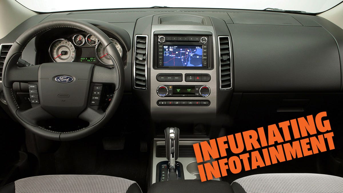
What’s the Worst Infotainment System of all Time?

Does the Ford Edge have the worst infotainment system of all time? Photo: Ford
A great infotainment system can make using a car a breeze. Most modern cars will let you control most of the vehicle’s settings, the music, the navigation and your cellphone through an intuitive interface that’s pretty simple to use. But that isn’t the case with every car out there.
Sometimes, when you climb into a car to get ready for a long drive and go to set the sat-nav, or queue up a podcast for the journey, you’re met with silence from the center console. Maybe it’s struggling to determine your destination, sync to your Spotify, or the input might just be taking forever. In that case, you might brand it the worst infotainment system of all time, but would you be right to do so?
We want to hear from you about your bad experiences of in-car entertainment setups. Whether it’s a system that can’t quite deliver on the joys it promised, or one that sets out to do far too much, we want to hear.
So, what are your picks for the worst infotainment systems of all time?
Maybe you still have nightmares about the first-generation Ford Sync and the firm’s tumultuous attempts to fix its flaws. Or maybe you are still so scarred after the whole Cadillac User Experience fiasco from 2012 that you may never even sit in a big ol’ Caddy again?
Whether it’s unintuitive menu options, clumsy controls, or a frustrating attempt at creating a novel input method, we want to hear about it. Head to the comments section below and tell us your infuriating infotainment encounters. This is a safe space, where everyone’s free to rant.
We’ll round up some of the worst offenders in a slideshow tomorrow afternoon.


