Volvo teases minimalist, no-button EX90 interior

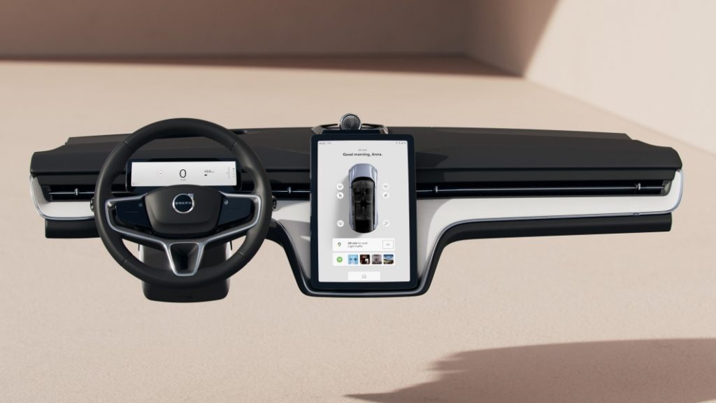
The march to the November 9 reveal of the Volvo EX90 takes its next step with these renderings of a pared down interior. We’ll see soon how it looks once the new materials, textures, colors, and tunnel console are added, but for the moment, there are four elements: An instrument panel with a demure HVAC vent, broken up by a steering wheel, a small, uncovered screen behind the wheel, and an infotainment screen. The portrait-oriented tablet carries over from current Volvo design, so too a three-spoke wheel. Everything else in Volvo’s current interior schemes is thrown out, including the knobs and buttons on the center console. It looks like the premium brand’s version of the interior we were introduced to in the Polestar 3. Fitting, since both vehicles will ride on the same platform and be built at the same U.S. plant.
The cabin’s physical design and the car’s technology share a same philosophy, which is, “What you need, when you need it.” Volvo says that the sensor suite around the EX90 will give the car a 360-view of what’s happening outside and inside the car. ” Thomas Stovicek, head of UX at Volvo Cars, said, “Since the car also understands its surroundings and you better than ever before, we can create an even safer situation by reducing mode confusion, distraction and information overload.” On the infotainment side, we’re told this will be done by the vehicle providing contextual options and menus on the two screens. The center screen, which looks larger than the current XC90 unit, performs the roles we’ve come to expect of it. Autocar spoke with automaker developers and said the screen “will also show information based on context. If you’re simply driving along, a bar near the bottom of the screen will show media information; if you’re on a call, it will show other controls; if it’s cold, it may show the defrost button, etc.”
This situational knowledge will be especially important as more roads are opened up to hands-free driving and as self-driving capabilities become more capable. Swedish engineers point to the handover from hands-free and autonomous driving back to hands-on driving as a crucial moment. It wants to make that handoff “effortless and intuitive.” The display behind the steering wheel is where the driver will go first for traditional info like speed and range, also to understand the operational state of the driver aids. Sounds like another take on what Nissan does with the Ariya, color-coding the gauge display to convey how much work ProPilot Assist is doing.
And perhaps we’re reading too much into this, but the range display shows 488 kilometers of range on a nearly full battery. Answers to questions will begin arriving in 12 days.


