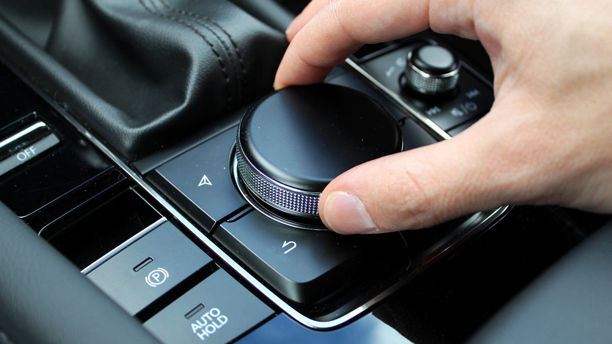
The Mazda3's Infotainment Dial is Distracting, No Matter What Mazda Says

Photo: Adam Ismail
Distracted driving a is a big problem, especially with all the wonderful things modern cars can do. Purely digital controls via touchscreens and capacitive keys aren’t the answer, because we need to keep our eyes on the road and physical feedback helps us do that. On the other hand, old-fashioned buttons aren’t adequate to navigate the complexity of modern infotainment systems. A mix is necessary, and every automaker has its own school of thought of where the proper balance lies. Mazda’s is wrong.
I recently had the privilege of daily driving a Mazda3 Turbo for a week. It was a fine experience that I’ll expand upon in an upcoming review. One of the downsides, though — which I kind of knew going in — was the infotainment system interface. It’s a dial, positioned between the gear selector and center console.
The most recent Mazda I’d driven before this 3 Hatch was a 2021 Miata RF. That roadster had a dial too, but it also had a touchscreen. The display responded to touch only when the car wasn’t moving; all other times you had to use the knob. I expected the same from this 3, but it’s actually worse — the panel isn’t touch-sensitive at all, so the rotary is really all you get.
Photo: Adam Ismail
This is no sweat for Mazda’s own UI, as it consists of only vertically scrolling lists that you can move between by nudging the wheel left or right. In those cases, the dial works great. But if you like to use CarPlay or Android Auto — and who doesn’t — everything falls apart.
Mazda’s rationale for this interface design is predictable. If you remove your right hand from the steering wheel to reach across the front row and toward a screen, it’s almost impossible not to exert some involuntary force on your left hand that’s still holding the wheel. You also have to shift your eyes from the road and to the display. That’s always unavoidable, but at least Mazda’s way you wouldn’t have to reach. It’s more comfortable to casually rest a hand on a dial and quickly shift your focus from the screen to the dashboard and back — eyes are good at that sort of thing — rather than having to look away and move your body at the same time. I get it.
The problem is that the only user experience that benefits from this thinking is Mazda’s, because Mazda’s was obviously designed for it. Using a dial to navigate something like CarPlay that was clearly meant to be touched isn’t just annoying or inconvenient — it’s unsafe.
Photo: Adam Ismail
Software made for touch doesn’t have to organize everything in lists. CarPlay’s home screen has app icons laid out in a grid; it also has a persistent vertical sidebar to the left with recent apps. Lists are used only where they make sense, say in a music player like Spotify.
At one point during my time behind the wheel of the Mazda3, I was listening to Apple Music and needed to scroll down from the top of a list to one of the items near the bottom. Halfway through the list was a horizontally arranged bar of recently played albums, like five or six of them. If Mazda just let me touch the dang panel, I would’ve been able to flick past that break, found what I was looking for and tapped it in two seconds. But the dial meant I had to scroll through those albums individually, which made the whole process take much longer.
These sorts of menus are very frustrating to navigate with a dial, or anything other than fingers.Image: Apple
In another instance I had summoned Siri, and wanted to cancel whatever exchange we were having. There’s an on-screen Cancel or Back button that CarPlay places at the top left of every screen. It’s easy to tap, because it’s always in the same place. In this situation of course I couldn’t do that, so I pressed the car’s physical Back button, near the dial. But CarPlay didn’t recognize it, and I didn’t want to spend 10 seconds spinning a knob to try to figure out how to highlight an item in the corner of the screen, so I just waited until Siri gave up.
These are just two examples. Sure, with enough time I’d get used to these annoyances, as we do with all our cars. That doesn’t change the fact that a dial was simply the wrong tool for these jobs. And even though Mazda isn’t responsible for CarPlay, it still has to play nice with Apple’s platform. CarPlay has to be as easy to use as the software that’s built into the car, because customers are going to use it all the same.
Photo: Adam Ismail
Hell, I’d take a well-designed touchpad, like Acura’s, over Mazda’s system. And “touchpad” is a dangerous word in the Jalopnik Slack — I should know because when I shared that opinion, my colleagues described it as “horrifying” and a “world is flat-level” take. I’d prefer a pad because, much like a touchscreen, it’d allow me to directly pinpoint any screen element with my finger, the only layer of abstraction being that I wouldn’t be touching the screen directly. But, I also wouldn’t have to reach. It’d be the best of both worlds.
This is a problem for which there’s no one-size-fits-all solution, and I know that. Our brains all work a little differently and not every driver will find the same interface intuitive. In fact, redundancy is probably the best approach here; touchscreens are really cheap to make these days, after all. We should all have the ability to cater these experiences to our preferences. I just wish automakers would stop telling me mine are unsafe, when I’m the one forced to take my eyes off the road.


