See If You Can Spot The VW Connection In This Old Apple Mac Keyboard
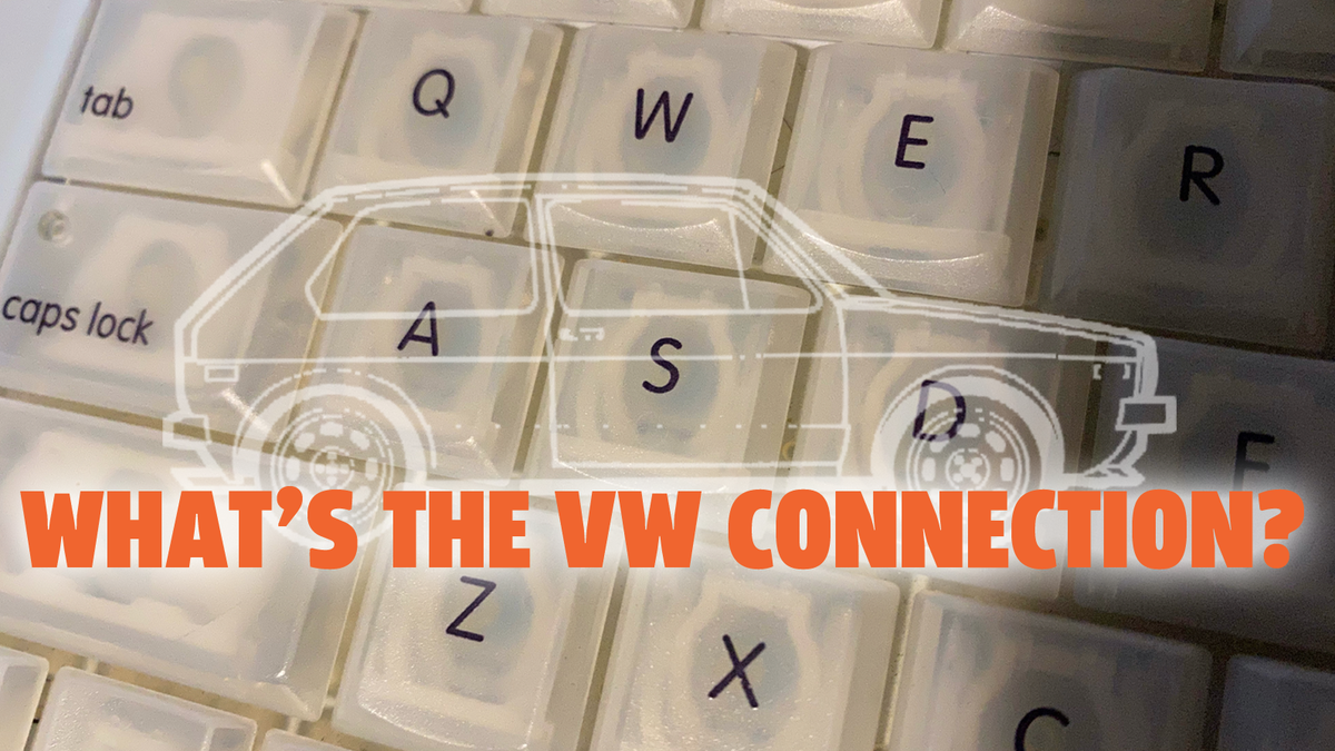
Image: Jason Torchinsky
Overlaps of design between the automotive world and the computer world are really pretty rare, even if we count those silly red laptops with Ferrari logos on them. Sure, one of the original designers of the Datsun 240Z also designed an early laptop, but aside from that, what sort of cross-pollination was there? Well, it turns out, there was actually a lot, but it’s kind of subtle. It starts with Volkswagen and ends up with Apple. There’s even a reasonable chance you’ve seen an example of this, because it has to do with the typeface Apple used on keyboards from 1999 to 2015.
I remember hearing about this before, especially because there was a sort of strange public mutual admiration between Apple and Volkswagen in the late 1990s. For example, there’s this passage in the May 1998 issue of Newsweek, from an article called “Steve Jobs Unveils the iMac,” which starts with this:
“Look at That!” says Steve Jobs he pulls his Mercedes into a parking space. He’s pointing at a new Volkswagen Beetle, and as soon as he parks, he dashes over, circling the shiny black Bug, taking the measure of a well-publicized update of once great product design. “They got it right,’’ he concludes.
Image: Apple, VW
I remember this era very well, and I remember being excited by both of these designs. Both the re-born Mac and re-born Beetle felt modern and high-tech but also approachable and friendly; they were all curves and bright colors and toy-like, real things that retained the delight of youth. Both the car and computer were playing in the same general pool of design, and these very different companies seemed to share the same general vision, aesthetically.
I was reminded of the very direct connection that came of this by a tweet I saw the other day:
Holy crap, that’s right! The typeface Apple used on keyboards was VAG Rounded, starting with the iBook in 1999. I pulled mine off the wall to see for myself, and yep, it checks out:
Image: Jason Torchinsky
It’s sitting next to an even older Apple //c I’ve been messing around with, which sported a very different design language. I figured it can’t hurt to show you both, right?
Apple started using this typeface in 1999, but the history goes back to 1979, and the history behind it is interesting. The typeface came about as part of Volkswagen’s process from transforming from the original, air-cooled, rear-engined, Beetle-driven Volkswagen that started in 1938 into the front-engined, liquid-cooled Volkswagen that we know today.
As I’ve written about before, modern Volkswagen isn’t really Volkswagen. It’s really a re-born Auto Union, and it was this transition that spurred VW to develop its own typeface.
You see, with Auto Union came all of their tech, usually sold under the DKW brand just prior to the sale to VW in 1964, but also the Audi name, which VW wanted to re-introduce. VW wanted to find some visual identity that was between the bold, sans-serif Futura they’d been using since the early ‘60s and the classy, serif’d Times font used by Audi.
They needed something that would work for dealers that carried both VW and Audi, something that captured an overall common element between the two. It was a tricky design problem.
Image: VAG Rounded
Art directors at VW decided on a rounded sort of typeface, but weren’t able to find anything that quite matched what they were looking for, so they designed their own, a clean, modern looking font that has rounded end caps to letters, creating a very friendly, accessible-looking typeface.
Also interesting is that while the type was basically designed by hand, it was “refined” on a PDP-8 minicomputer, making it an early example of typography designed with computer-based tools.
VW used this typeface on a lot of branding and materials throughout the 1980s, and up until about 1992; I have a few ‘80s-era brochures that show it off nicely:
Image: Jason Torchinsky
Look at that! Very appealing and friendly-looking, just the thing to lure you into a new Dasher wagon. Here’s a good example where you can see it in multiple weights, used as a headline and body typeface:
Image: Jason Torchinsky
The name, VAG Rounded, is a bit of a mystery, though. I always assumed it stood for Volkswagen AG, but that doesn’t actually seem to be the case. According to Bertel Schmitt, who was a Creative Director at VW at the time and is now a fellow autojourno, the story behind the name was always murky:
Yeah, I remember VAG and nobody, including dealers, knew what it stood for . Volkswagen AG?
It stood for nothing.
We were all sworn to secrecy, but to hell with it.
In the course of the aforementioned name change operation, someone came running down the hall and shouted: “Everybody STOP!”
Breathlessly, he told that he just had been in the legal dept, and legal said if the name of the company is changed, then new dealer contracts would have to be written. At the time, nobody (except the dealers) thought this was a bright idea.
So they came up with V.A.G. It could have stood for anything: Volkswagenwerk AG, Volkswagen AG, Volkswagen Audi Gesellschaft, you name it. Intentional ambiguity. But it was highly verboten to say what the acronym stood for.
Inside VW, for many years, the joke went that V.A.G stood for “Von Adolf Gegründet” (Founded By Adolf.) Those were the days when laughter still wasn’t illegal at VW.
My guess is that the real meaning is probably not the Hitler one.
The reason that this in-house-designed Volkswagen typeface ended up being used by other companies, including Apple for something that is as letterform-focused as a keyboard, is that VW deliberately made the typeface public domain, as that would help their worldwide dealer network get access to the font as needed.
So, the font was free for Apple to use on their keyboards and for plenty of other companies to use as well. Here’s some examples you’ll may find familiar:
Image: Skype, Jollibee, whatever that is
So, next time you whip out your 1999 iBook before hopping into the seat of your 1985 Dasher fastback to impress everyone over at the slam poetry jam or whatever revival late ‘90s/early 2000s bullshit you’re into, make sure to point out the tie-in between your car and computer to anyone who will listen.
I’m not making any promises, but I bet it’ll get you laid. Typography is powerful that way.