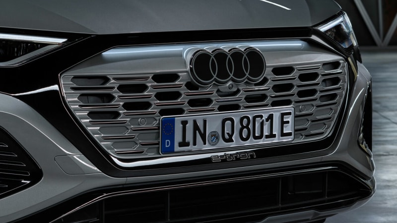
Audi's new logo is a ringer for the old one

Four intertwined rings have symbolized the origins of the Audi brands for nearly a century. Now a new graphic design is in play: It’s still four rings, but it features a 3D look in two dimensions, free of chrome and in high-contrast black-and-white.
“The clarity of the new black and white rings makes our corporate identity unmistakable,” said brand designer André Georgi. “The thin black border around the rings makes for a consistent, premium-quality appearance, regardless of the car’s paint or radiator grille color.”
About three years ago, Audi designers ran with the idea to “flatten” the logo — a look it has come to call “Audi Type” — “to ensure a consistent brand presence across all customer touchpoints,” according to brand strategist Frederik Kalisch.
Another consideration, he said, is to ensure that the logo “plays” nicely on digital screens, “essentially to depict the rings in a manner that suited the medium. Three-dimensionality on two-dimensional displays would not have met our technical and aesthetic requirements.” The so-called flat look has lately been adopted in logos from a number of other manufacturers, including General Motors, BMW, and Audi’s sister brand, Volkswagen.
The original Audi logo dates back nearly a century, symbolizing the merger of four automobile manufacturers based in the German state of Saxony: Audi, DKW, Horch and Wanderer. The new firm was named Auto Union AG.
Subsequently, the brand name Audi took center stage on its vehicles: first in brown, then in red. Starting in 1978, a black oval with white lettering characterized the brand identity. In the 1990s, the company once again concentrated on the rings, this time with a three-dimensional look.
Related video:


