2024 Mazda CX-90 Long-Term Update: Ours has a touchscreen, yours may not

Mazda does things its own way, even when the majority of the automotive industry has agreed to do it the opposite way. Take our long-term CX-90 PHEV’s infotainment system, for example. In most circumstances, it does not operate as a touchscreen. But then in other cases, it does. This is just another example of Mazda’s long and testy relationship with touchscreens. Let me explain.
Simply put, our CX-90’s screen will only accept touch inputs while using Apple CarPlay or Android Auto (which you can actually disable for in-motion driving for some unknown reason). You will note I underlined “our.” That’s because only the Premium Plus trims and every Turbo S trim have this capability, and we have a PHEV Premium Plus. If you have a different trim, the display is not a touchscreen. This functionality also aligns with the touch-capable screens measuring 12.3 inches while the touch-less ones measure 10.25.
Being able to use touch control while in Apple CarPlay is a big benefit and a significant reason to step up to a higher trim. But also, c’mon, Mazda. Why are we gatekeeping touch controls to upper trim levels? It’s not a luxury feature by any means, so it just feels wrong to treat it as such. Worse, the cheaper Mazda CX-50, CX-5 and Miata all come standard with touch control despite not offering the CX-90’s big, 12.3-inch screen. The CX-5 and CX-50 even have a 10.25-inch screen, just like the lower CX-90s.

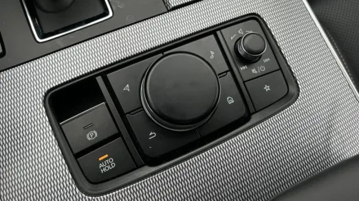
The above said, if you have a CX-90 without touch controls, all is not lost. Mazda has programmed the menu shortcut buttons surrounding the rotary control knob to operate CarPlay and Android Auto functions, much as it does native systems. I’ve found this can be quicker and better than using the touchscreen. For example, all that’s necessary to open your default music player is a quick stab of the “Media” button next to the rotary knob. The same applies to quick toggling to your navigation app or phone app. There’s even a “back” button placed intuitively for when you’re trying to navigate through Spotify or other menus. Plus, a quick tap of the “home” button brings you to the CarPlay/Android Auto app drawer of sorts. Importantly, a long hold takes you all the way back out to Mazda’s native infotainment interface. That puts all of your vital controls a quick tap or toggle away. The same goes for volume and seek control, which can be accessed from the handy volume knob (that rocks side-to -side to seek or rewind) right next to the big rotary control knob.
Frankly, using the rotary knob and hotkey buttons while moving is a million times quicker and feels safer than trying to stab away at a screen. I even find myself using the rotary knob and buttons more often than the touchscreen because it’s a more efficient way to accomplish certain tasks. Obviously, this isn’t always the case. Menu diving or navigating through Waze’s settings will always be better with touch control. Trying to do so via the rotary knob can turn into an arduous task, and it’s only then that I reach for the touch controls.
Would life be easier if Mazda just made touchscreens standard across the board for the CX-90? Yeah, it would be. Some tasks are better operated with a touchscreen, others with a knob, and there’s also the matter of personal preferences. Cars that offer both, for instance the new i5 and many older BMWs, are better for having this redundancy. I’m a huge defender of user interfaces designed with rotary knob control in mind – it’s one of the reasons I loved BMW’s iDrive for so long – and Mazda’s execution of such a system is superb. Now, let’s just get touchscreen control baked into every CX-90 …


