2023 Volkswagen ID.4 Interior Review: The good and the frustrating

The Volkswagen ID.4 has been around for a couple of years now, and we’re beginning to see more and more of them on the road as customers recognize value in an attractive, spacious EV in a just-right segment. It’s not the fastest out there, but it’s still plenty quick, with surprisingly deft handling. The looks inside the cabin are quite attractive, too. Our fondness for the interior design comes with a fairly hefty caveat, though. What you get in terms of clean, architectural aesthetics comes with a payoff in ease of use. As visually cumbersome as buttons are, replacing them with infotainment menus and touch-sensitive controls introduces some frustrations.
So let’s take a look at the interior of the now-made-in-the-U.S. ID.4, admire its visual appeal and some clever features, and complain about some odd interface experiences.
The cabin feels spacious and airy, especially with the glass roof and the light gray and blue leatherette bringing some brightness inside. It’s an inviting space that feels sleek and modern, and a bit minimalist. There’s a downside to that, though, which we’ll address as we go. First, let’s admire the design and materials.

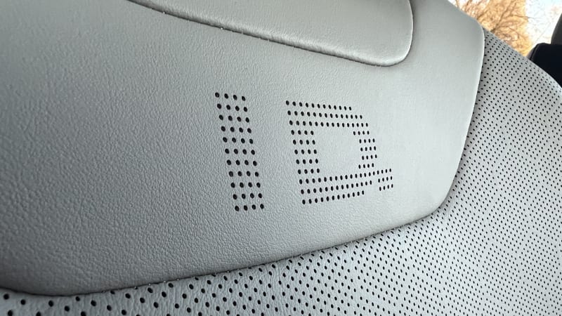
I like the pattern of the perforations in the seats, arranged in little hexagonal matrices. On the otherwise unperforated material just below the headrests, the holes create an “ID.” logo, denoting VW’s electric sub-brand without going so far as to indicate the individual model. We already know what car it is, after all.
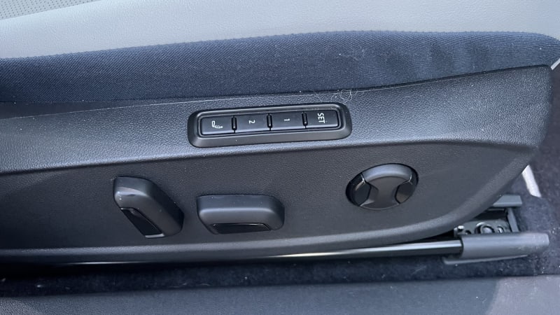
The seats themselves are quite nice, with the contouring balanced more toward comfort without abandoning support. The bolsters won’t hold you as tight as those in a luxury sports car, but they’re firm enough to keep you from sliding too much when taking advantage of the ID.4’s sharp steering. Furthermore, the front seats are heated, ventilated, adjustable 12 ways, with lumbar massage and two memory settings. Putting the controls for adjustments and memory down on the side of the seats, with the heating and ventilation controls in the infotainment screen, helps keep the doors and dash visually clutter-free. The downside is you have to hunt for the controls.
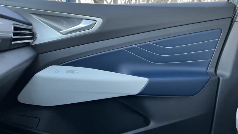
That lack of clutter benefits the doors, letting shapes, textures and colors take center stage uninterrupted. I especially like the contrast of the blue door trim with the three angled lines of gray stitching. I feel like the look of the armrest and door handles are also integrated in an appeasing way.

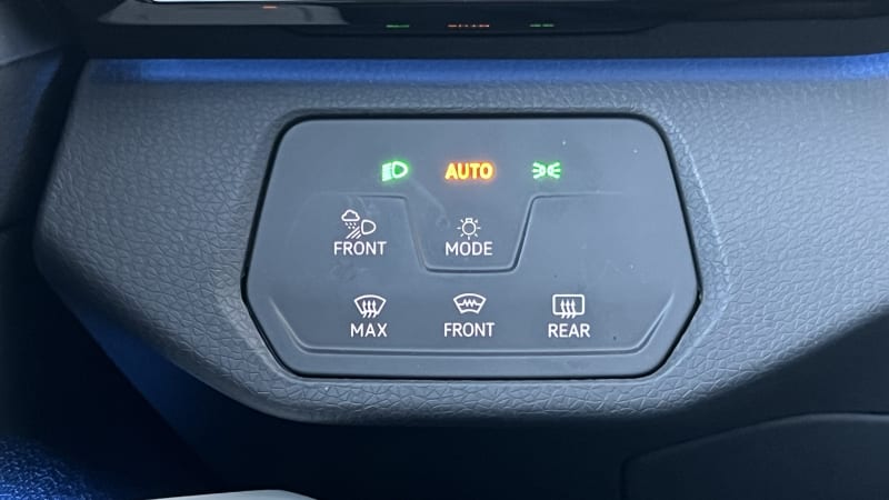
With your eyes returning forward, there’s not a lot on the dash. There’s the steering wheel, of course, with a small digital instrument cluster perched atop the steering column. A tablet-style infotainment touchscreen rests in the center of the dash, with a couple touch-sensitive sliders below for cabin temperature and audio volume, and nearly invisible shortcut buttons for things like climate and drive mode menus below that. The dash is bookended by air vents, with central vents tucked below the infotainment screen. Hidden to the left of the steering column is a small panel with touch-sensitive buttons for controlling the lights and defrost.
The digital driver display is small, but at least it isn’t placed awkwardly, and is easy to see. It’s configurable, too, allowing you to put the bare minimum in front of you, or arrange it to show the status of your driver aids as well as navigation information, among other things.
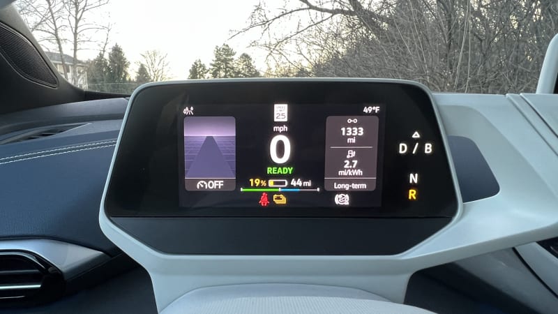
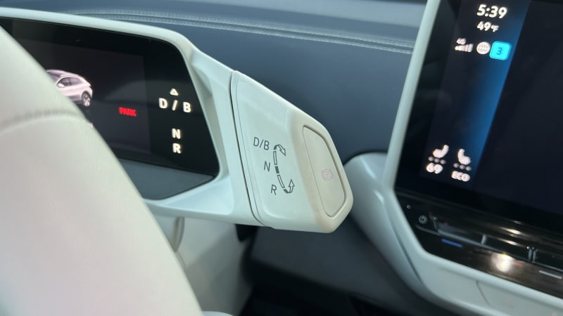
The appendage off to the right of the screen is the interestingly placed drive selector. You reach up to rotate it away from you to select drive (or the “B” mode which feeds in more regenerative braking), and toward you to put the car in reverse. It’s unconventional, for sure, but actually quite intuitive once you familiarize yourself.
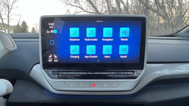
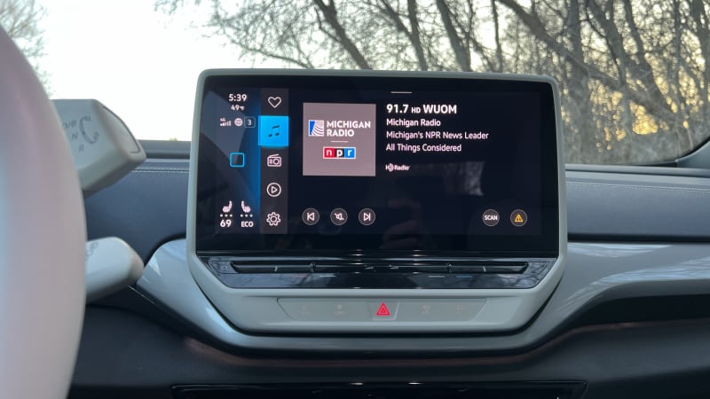

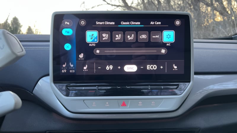
The infotainment touchscreen is oriented toward the driver, which makes it easy to see and reach. The fact that so many of the vehicle functions live within the menus keeps the car free from buttons, which is a great visual trick, but frustrating in practice. There are multiple menus for climate, for instance. One, called “Smart Climate” allows you to select specific options like “Warm Hands” (which does a surprisingly good job of doing what it advertises) and “Cool Feet.” There’s a “Classic Climate” menu with the familiar HVAC controls we all know and love. There’s also a screen for “Air Care,” which has one single button that starts an air purification process. And, yes, that’s all accessed through the entertainment screen. You can adjust the temperature without going into a menu, though, but it involves hard-to-discern touch sliders just below the screen, with an audio volume slider tossed in between them to make it more difficult.
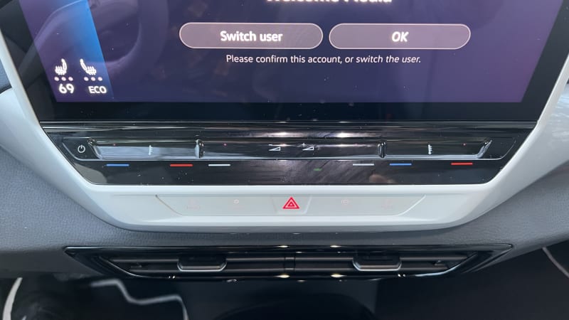
Speaking of frustrating controls, the ones to operate the windows are weird. There are four windows, but only two levers. You have to hit a little touch-sensitive button below them to toggle between the front and rear windows.

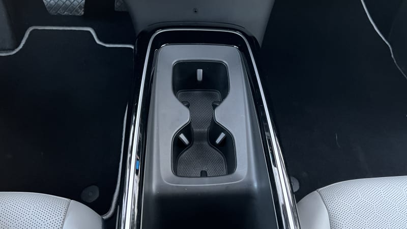
But, look how neat and simple the center console looks without any buttons, infotainment controllers or gear selector. Just a couple of cupholders ahead of a phone cubby (with USB-C ports and wireless charger) and an under-armrest storage bin.
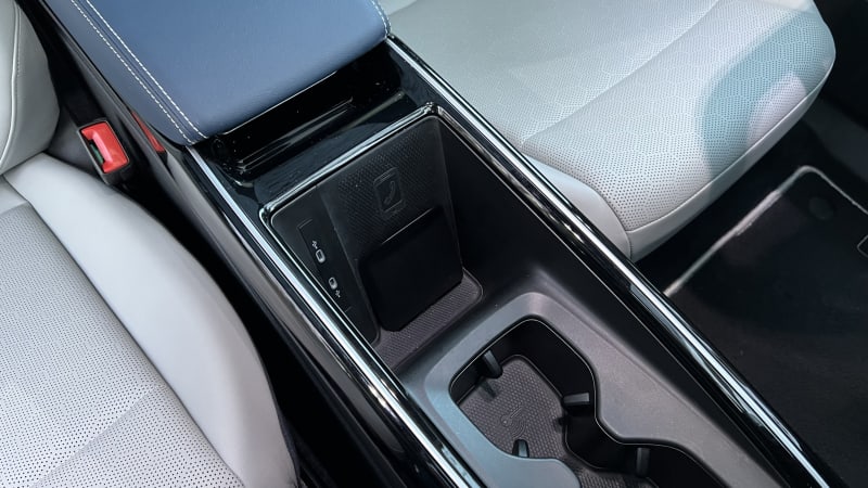
On the back of the center console, below the rear air vents, is another cubby for rear passengers, as well as another pair of USB-C ports.
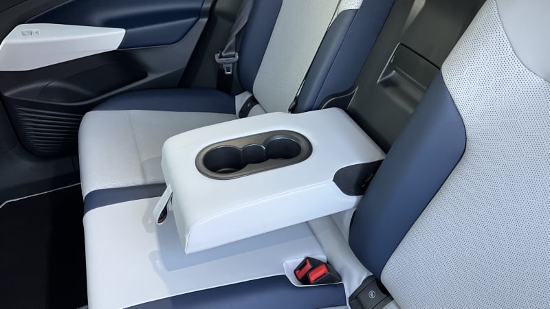
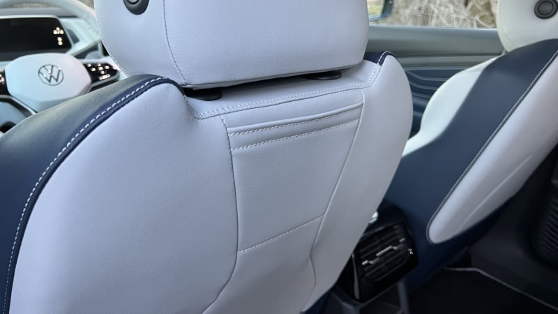
Like the row in front, the outboard rear seats are comfortable and supportive. A center armrest can fold out from the middle seatback to provide a pair of cupholders. it also reveals a panel providing a pass-through to the rear cargo area. In addition to the usual pockets on the rear of the front seats, there are smaller pockets above that, just about the right size to stash a phone.
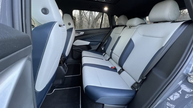

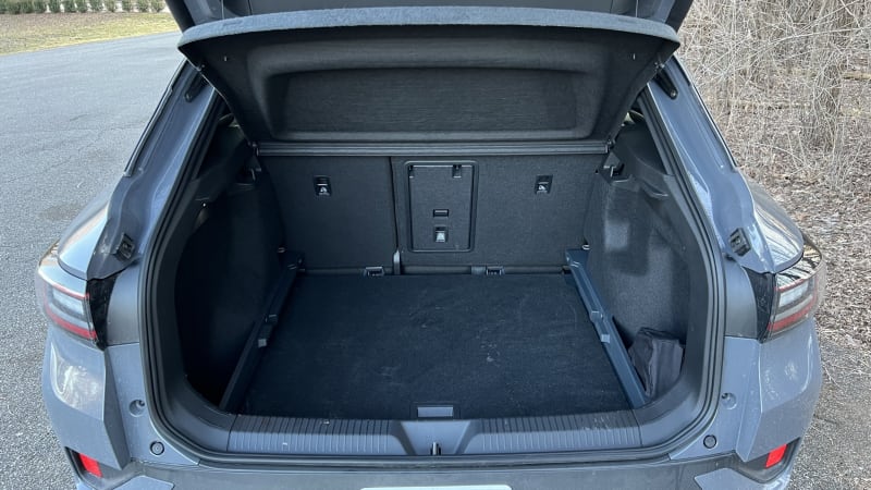
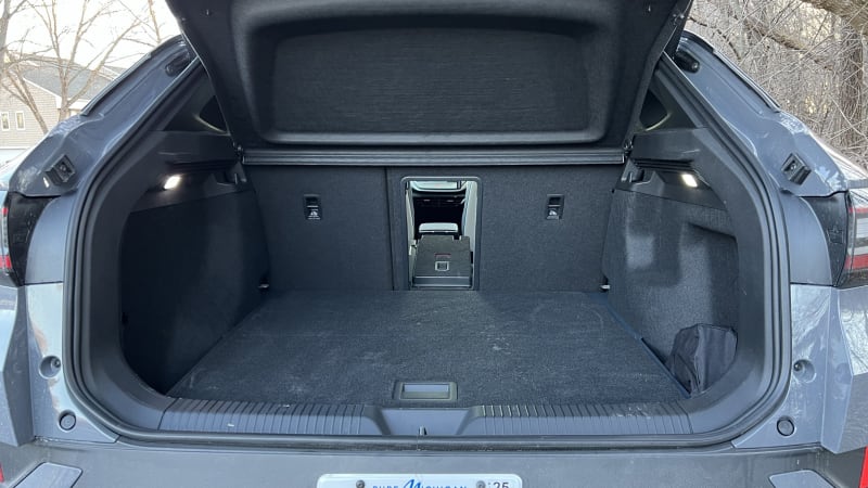
Finally, the rear cargo area is quite spacious. On either side of the cargo floor are deeper pockets to hold items you don’t want sliding or rolling around back there. Underneath the cargo floor is yet another storage space, the perfect place to stash some car rope. You should always have a length of rope in your daily driver.

Would my consternations regarding the various controls — specifically the lack of easy-to-use buttons and a heavy infotainment experience — steer me away from the ID.4? No. I’d learn to live with them. The comfort and good driving experience are worth it. If I could, though, I’d trade back a little bit of that clean design for a bit more user-friendliness
Related video:


