20 craziest car redesigns of the past 20 years
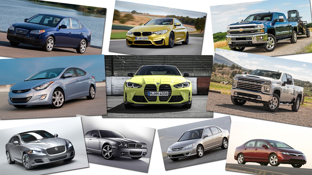
Call them craziest. Call them most radical. Call them most significant. Whatever. These are the car redesigns of the past 20 years that ventured furthest from their predecessors and the automotive norm of careful evolution.
These are cars that totally chucked away the old playbook from one generation to the next. Some were massively successful in rejuvenating or flat-out establishing their brands. Some were “what were they thinking?” flops that required subsequent course correction for the next generation. Some went beyond styling to include fundamental mechanical differences. Some are on sale today.
Now, to be clear on the criteria here, the redesigns must carry the same nameplate, so no Kia Optima to K5. The nameplates must also have been in continuous production from one generation to the next, so no Jeep Cherokee, Ford Maverick or Dodge Challenger. All are also in alphabetical order.
Acura TL
2009 Redesign
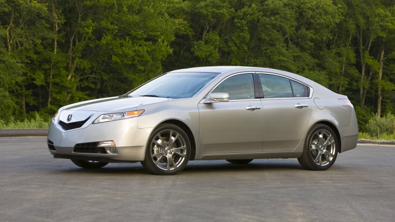
Oops. The Acura TL was one of the best-selling luxury sedans at the turn of the century, and with the third-generation model (above left), it reached new heights in terms of both popular and critical reception. It was a great car, and although its sales began to cool as that generation got on in years, it would fall off the cliff with the fourth-generation TL introduced for 2009. It was bigger. It was worse to drive despite offering super-handling all-wheel drive. Worst of all, it was hideous front and back, with Acura’s new Robo-beak grille drawing the most disdain. Not only would the TL never recover its former glory, Acura’s own fortunes largely mirrored it. Today’s TLX is very much in keeping with that third-generation model, as is Acura’s wider re-focus on driver engagement, but they’re only digging out from the hole started with that ’09 TL.
BMW M4
2021 Redesign


In most ways, the redesigned 2021 BMW M4 was an evolution of the car it replaced. If you simply looked at it from the side or from the back, you’d see a tidy evolution and go, “Sure, they’re both M4s.” And then you’d get to the front. “Gaaagh!” has generally been the response when viewing ol’ beaver teeth up there. Ditto the M3 and every 4 Series. Maybe history will be kinder to this redesign, but at the moment, BMW still seems absolutely bonkers.
BMW 5 Series
2004 Redesign


The M4’s beaver teeth of today was the 7 Series’ “Bangle butt” of nearly 20 years ago. That was in reference to that car’s controversial rear end and the head of BMW design, Chris Bangle, who didn’t actually design the thing. While that 7 Series might have been controversial, it was the subsequent 5 Series redesign that was a much greater departure from what had come before. The preceding, “E39” 5 Series was effectively considered the perfect sedan and today is considered a classic, which is a rare distinction for any sedan. Check out used car values for the E39 M5 … they’re insane. Then check them out for the succeeding E60 M5 … they’re lower despite all that V10 awesomeness. Front to back, the E60 was a radical departure from the tidy, clean proportions of the E39. I recall Car and Driver describing its face as “a Z3 with kabuki makeup on.” It was also an evolutionary dead end as the next-generation 5 Series largely returned to business as usual.
Chevrolet Silverado HD
2020 Redesign


Chevy keeps insisting that its customers really love the new Silverado HD front end. If so, good for them. Others have been less appreciative. Still, regardless of whether you love the look or find it ghastly, you can’t deny that Chevrolet really decided to shake things up with this latest generation. First, this is just about as bold as a pickup redesign gets, at least after the 1990s. There’s nothing evolutionary about that, ah, face. Second, it makes it easy to pick out an HD versus a Silverado 1500. We’re guessing all those customers particularly like that.
Ford Escape
2013 Redesign

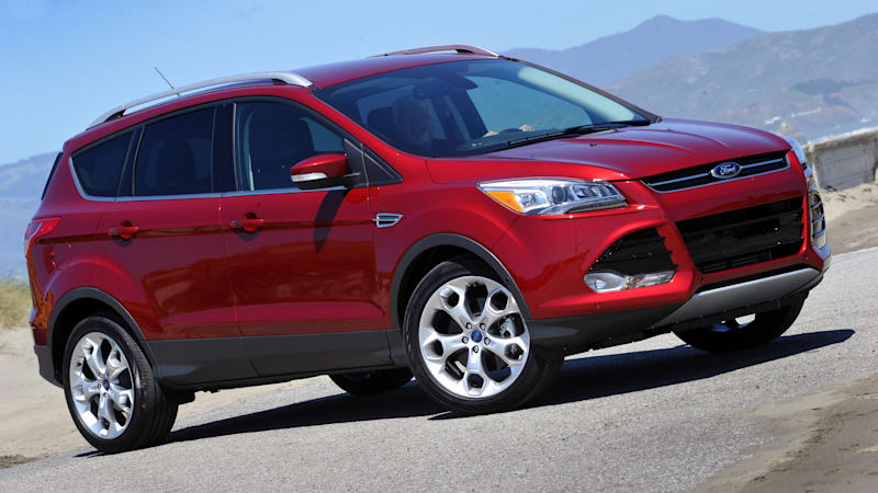
Here’s the first of several redesigns on this list where it looks like we’re looking at cars built 10 years apart rather than one. Or just completely different nameplates altogether. The Escape was one of the first compact crossover SUVs, but it largely followed the truck-based SUV playbook of being upright and boxy. There was a massive overhaul for 2008 (pictured above), but the platform and general boxy concept carried over. For 2013, the automaker’s “One Ford” policy saw the Escape aligned with the Kuga sold in other markets. And when you look at the previous Kuga, it’s pretty obvious who the new Escape’s real father was. So, in a way, they were completely different nameplates.
Ford Fusion
2013 Redesign

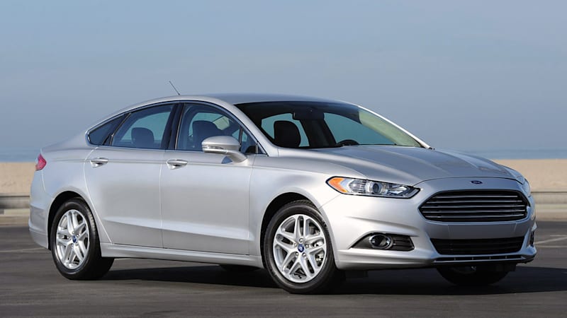
Here’s another from the One Ford era, but whether you called it Fusion in Flint or Mondeo in Manchester, this was a radical departure for Ford’s midsize sedan. People at the time “criticized” it for looking like an Aston Martin, but come on, that’s like criticizing your significant other for looking like Gal Gadot or Regé-Jean Page. While the 2011 Hyundai Sonata declared that family sedans didn’t need to be anonymous, this Fusion showed they could actually look really good. Still does. RIP.
Ford Mustang
2005 Redesign


Sure, this redesign turned back the Mustang clock visually, but there’s no denying that the 2004 and 2005 Mustang look absolutely nothing alike. And, for the first time since 1979, there was an all-new platform.
Honda Civic
2006 and 2016 Redesigns


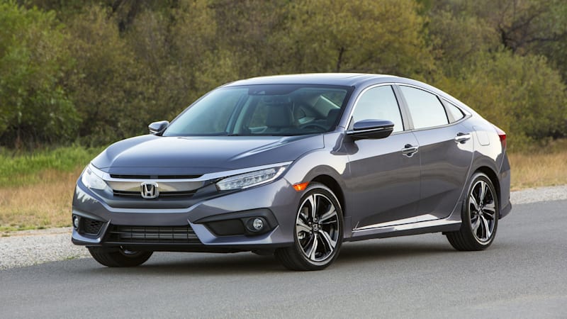
The Honda Civic from 2001 to 2005 might have been a tad conservative by comparison to its predecessors (and boy are Hondaphiles still grumpy about it switching to a MacPherson strut suspension), but it still followed Honda’s evolutionary norm. There was nothing normal about its successor, the 2006 Honda Civic, which was bold, a bit weird, and quite simply a stunning departure for its brand. From its extremely cab forward proportions to its unusual split instrument panel, this was not Honda as usual. It was therefore even more unfortunate that the company not only went the conservative, evolutionary route for the next-generation model for 2012, but so badly phoned in the entire car there was an emergency refresh a year later. For 2016, which was a year earlier than the Civic’s usual generational cadence, an all-new Civic arrived with a bold and decidedly different look in terms of style and proportion. Once again, fortune favored the bold.
Honda Pilot
Every Redesign

One of these things is not like the other, one of these things just doesn’t belong … When Honda went about redesigning its trendsetting three-row family crossover, it decided to really stir the pot (perhaps not unlike the ’06 Civic) and go with a boxy, truck-like design. Unfortunately, the rest of the industry was making rounded, wagon-ish three-row family crossovers in the mold of the original Honda Pilot. Critics panned it, and fewer people bought it. Perhaps learning a lesson, Honda went back to a rounded, wagon-ish three-row family crossover design for the third generation. Sales were indeed a bit stronger, but it now faced increasing competition, especially from those with a more rugged look. You know, like the Kia Telluride and its boxy, truck-like design.
Hyundai Elantra
2011 Redesign
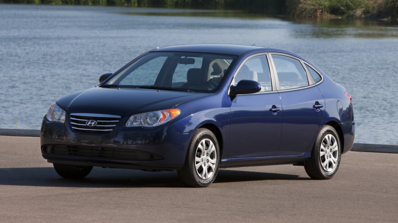
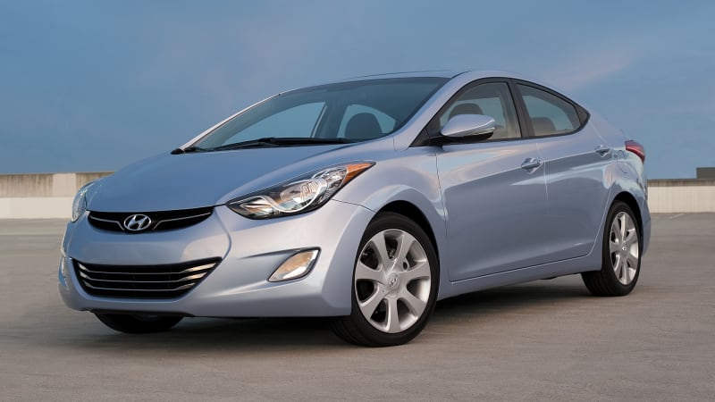
Most of this list could probably just be Hyundais and Kias from this era, as the sister brands underwent what can only be described as a renaissance. But then that would be boring. Of Hyundai’s various redesigns, none were as profound as the 2011 Elantra. It’s rare when “all-new” is so blatantly obvious. Never mind questioning whether both of these cars were Elantras, it was fair to ask how both were Hyundais.
Hyundai Sonata
2011 Redesign


The Sonata’s redesign for 2011 was revealed before the Elantra and was therefore the one that exclaimed to the world that a new Hyundai had arrived. The designer of the current Toyota Camry once told me that the ’11 Sonata was a car that made him and his fellow designers really sit up and take notice. It was a game changer, not only for its brand, but for midsize family sedans as a whole. Boring was no longer to be expected, and furthermore, the Sonata was a higher-quality effort than the contemporary Honda Accord and Toyota Camry, which were in a bit of malaise era. The current-generation Sonata, launched for 2020, is nearly as audacious of a redesign as the 2011, but of course, the entire family sedan segment has now lost its mojo. It certainly won’t have the same impact.
Jaguar XJ
2010 Redesign

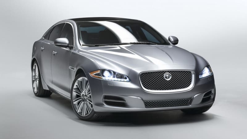
Talk about throwing away the playbook. The Jaguar XJ had basically looked the same for 41 years through multiple generations, and even if the last was a thoroughly modern, aluminum-intensive effort, no one could really tell because of the ye olde wrapper. The 2010 XJ was therefore a shocking departure for the nameplate and the brand, even if Jaguar design director Ian Callum had provided a preview of this new direction with the preceding XF. Here’s the interesting tidbit, though: Despite looking completely different, the two cars above share the same platform. Their wheelbases are even the same.
Kia Optima
2011 Redesign
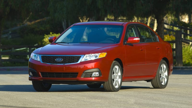

I once wrote that the second-generation Kia Optima was so anonymous that it had “styling by the witness protection program.” A Kia executive even quoted that during an auto show press conference for the car’s midcycle refresh — which is what you see above left. Yes, that was the supposed improvement. So yeah, the brand knew it needed to spruce things up a bit even if it took a few more years to really do it. While the 2011 Sonata was a game changer for its segment, the mechanically related 2011 Optima is arguably the better-looking car. Additionally, it had a lot more ground to make up since the preceding Sonata was a much better car than the preceding, dull-as-ditchwater Optima.
Kia Sportage
2011 Redesign


Hyundai and Kia sure were busy in 2011. Kia head designer Peter Schreyer, who previously gained fame for the classic Audi TT, firmly established his brand’s bold new direction with the Sportage. I mean, just look at those two SUVs up there. To paraphrase Chandler Bing, “could they be any different?” No, they really couldn’t. Inside, outside, the way they drove. Never mind a leap forward, this was a moon shot.
Mazda 3
2010 Redesign


Just so we’re clear, putting a great big smiley face on a car is not a recipe for success. The quasi-second-generation Mazda 3, which utilized the same underpinnings as its predecessor, shocked everyone with its enormously happy grille and exaggerated front fenders. We all would’ve laughed at the time if we also weren’t so sad that it was replacing such a taut, handsome little car. It was like putting a clown costume on a hunky guy. Thankfully, Mazda corrected this error in aesthetic judgment with the following two generations.
Mercedes-Benz G-Class
2019 Redesign


Just kidding.
Nissan Altima
2002 Redesign


Besides the dramatic styling change, this redesign established the Altima as Nissan’s new midsize family sedan. The previous one, the Maxima, had already cast off on its meandering 20-year journey into the premium realm. This all-new 2002 Altima was bigger and bolder than the two preceding generations, which were awkwardly sized in between the compact and midsize segments, and featured unusual downward sloping trunks. The 2002 was also heralded at the time for being engaging to drive, not just compared to the last generation, but to the entire family sedan segment. The Altima has evolved from this generation ever since.
Nissan Maxima
Every redesign in the past 20 years
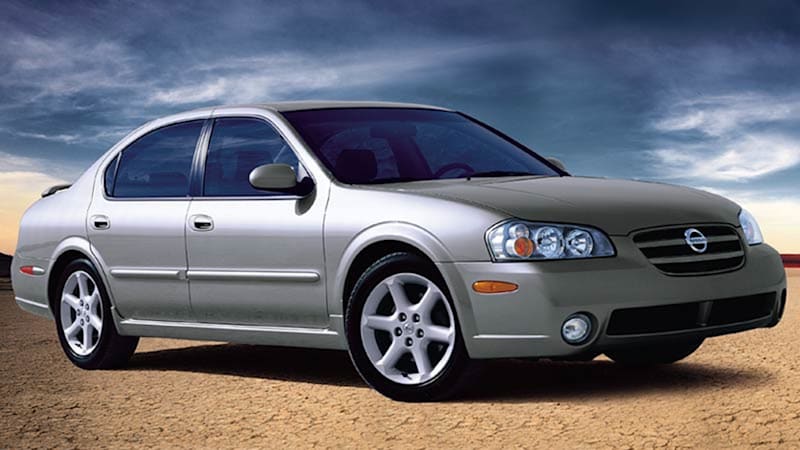


The Maxima has had an identity crisis since Nissan moved it upmarket at the turn of the century. First it was a luxury-adjacent sedan without much effort made to style the thing; it was a sort of decontented Infiniti. Next, it was more of a full-size sedan with a sporty bent and perhaps too much of an effort made to style the thing (it had a weird, mohawk-style, front-to-back glass roof panel among other oddities). Next, it went back to a smaller, luxury-adjacent sedan with handsome, if forgettable, styling. Next, it stayed near-lux and similarly sized, but established a new, audacious style direction for Nissan that would go on to influence the Altima, Sentra and Versa. It was sporty again, too, but its CVT and front-wheel-drive layout ultimately betrays its “four-door sport sedan” mission.
Nissan Pathfinder
2005 and 2013 Redesigns

The Pathfinder’s identity crisis went beyond aesthetics. It began the 21st century as a unibody, five-passenger SUV — in a way, a crossover. Then in 2005, it became a body-on-frame, seven-passenger SUV. That truck-like construction hampered its ride, handling, fuel economy and interior space relative the competing Honda Pilot and Toyota Highlander crossovers. As such, Nissan switched things up again, this time with a unibody, seven-passenger SUV. Basically, all of these may be called Pathfinder, but they’re all wildly different.
Toyota Mirai
2021 Redesign

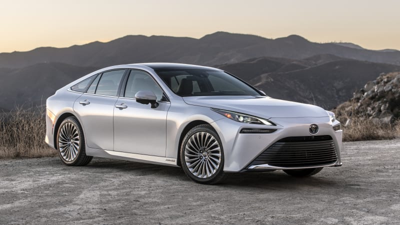
Unless you live in California, it’s very unlikely you’ve ever seen the hydrogen fuel cell-powered Toyota Mirai. Still, it exists, and the redesign it recently underwent for its second generation is as radical as they come. Originally, it was a sort of embiggened first-gen Prius with front-wheel-drive, four seats and truly ghastly styling. The 2021 redesign transformed it into a long-hood, short-deck, five-seat luxury sedan with rear-wheel drive underpinnings derived from the Lexus LS. It’s still powered by hydrogen, but the fuel cell is smaller and found under the hood — as opposed to under the front seats where it created a bizarre sitting-on-a-stool seating position in the first car. This is the ugly duckling that became a swan.
Toyota RAV4
2013 and 2019 Redesigns

Here’s another “one of these things is not like the other.” For its 2013 redesign, the Toyota RAV4 became more car-like, with a lower ground clearance, a proper hatchback and styling that was less like a mini SUV and more like a catamaran. Seriously, look at the front. And I’m not just making a joke, either, a Toyota designer once told me they were literally going for a catamaran look. Anyway, despite selling approximately 1.8 bajillion of them, Toyota took a risk by basically pretending the catamaran generation didn’t exist. Its designers and engineers decided to adopt a less car-like design and overall concept, effectively putting the RAV4 back on an evolutionary line with the more SUV-like third generation. It was similar in shape, higher off the ground, and didn’t look like alternative watercraft.


