Shocker! Test Shows Physical Buttons Are Less Efficient in Cars Than Touchscreens

You probably already know this, but it takes longer to perform specific tasks in new cars with many menu screens. If you didn’t already know this, a Swedish auto magazine proved it with science.Vi Bilägare tested a dozen vehicles—primarily new but also one 2005 Volvo—to see how long it took to perform a series of four tasks. It took 10 seconds in the old car and up to 45 in one of the new models.By timing the tasks as the vehicles were in motion, we can see how a simple thing like turning on the radio to a specific station can mean a driver’s eyes and focus are on the screen much more than they used to be.
Future drivers may look back at the current trend of replacing swaths of simple, physical buttons with touchscreens and wonder why we let this happen. The Volkswagen ID.4, for example, uses an almost entirely digital dashboard (pictured below) that makes using the infotainment system a headache. Eliminating or minimizing the number of physical buttons may look clean, but a new report from Sweden shows how touchscreens and endless pages of menus cause, in a sense, distracted driving.
Inside the 2023 Volkswagen ID.4.
Volkswagen
Swedish automotive magazine Vi Bilägare recently proved that physical buttons are safer than touchscreens by simply seeing how long it takes to do simple, everyday actions. The magazine had its reviewers perform four common tasks as they were driving:
Turn on the heated seat, increase the temperature by two degrees, and start the defroster.Turn on the radio and tune it to a specific station (Sweden’s Program 1).Reset the trip computer.Turn the instrument lights to their lowest setting and turn off the center display.
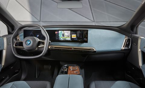
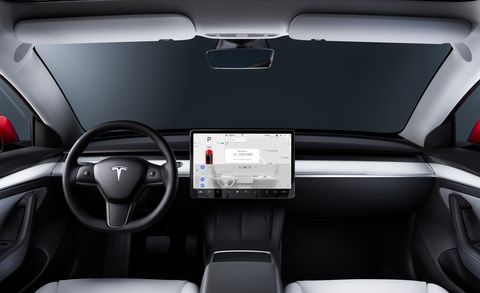
Before starting the stopwatches, the test drivers were given time to familiarize themselves with how to do these tasks in the various cars. The 12-car lineup included the touchscreen-heavy Tesla Model 3 and BMW iX as well as a Seat León and a Dacia Sandero. For comparison, Vi Bilägare also brought along a 17-year-old Volvo V70 with physical buttons for days. (Pictured at top: the similarly equipped 2007 Volvo S60.)


The magazine timed the drivers as they performed each task while driving the respective vehicle at 68 miles per hour. Interestingly, the 2005 Volvo V70 with its dedicated buttons took users the least time to run through the four tasks, at just 10 seconds. To accomplish the four tasks in the new BMW iX took three times as long: 30.4 seconds, but even that’s not as bad as the MG Marvel R, which required 44.9 seconds.
Vi Bilägare points out that it’s not just the lack of buttons that can be a problem. The way an infotainment system is designed plays a huge role, too. The system in the iX, for example, is one of the most complex and complicated user interfaces ever designed, the magazine said. The Seat Leon’s touch-sensitive climate control buttons don’t have backlights, which makes them difficult to use at night.
By timing drivers to see how long it takes to change the settings, the publication was able to come up with a distance that these drivers are moving (at 68 mph, remember) while they’re fiddling with buttons. This ranged from over eight-tenths of a mile (1372 meters) for the MG Marvel R down to just over 1000 feet (306 m) in the 2005 Volvo. The other vehicles were clumped around 600 to 900 meters, with the Dacia Sandero and Volvo C40 both in the low 400 meters.
This content is imported from {embed-name}. You may be able to find the same content in another format, or you may be able to find more information, at their web site.


