Science Proves That Buttons Are Better Than Touchscreens

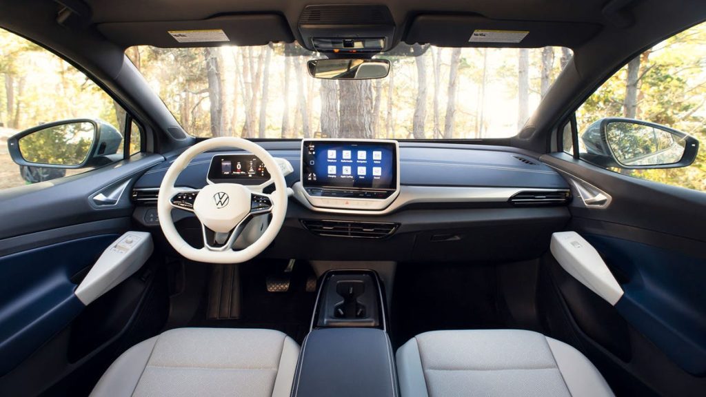
Is this what you wanted? Photo: VW
It’s an almost weekly occurrence that someone here at Jalopnik will bemoan the removal of buttons in favor of touchscreens in cars. And while, at times, this feels a bit like an old man shouting at a cloud, we have good reason to complain. That’s because it turns out that using buttons for systems like climate control, the stereo and some driving functions is actually safer than a screen controlling everything in your car.
This not-at-all shocking revelation comes from Swedish car magazine Vi Bilägare, which has been researching the usability of both buttons and touch screens in modern cars.
To do this, the publication tested the user interfaces in 11 different cars currently on the market. Models tested included the screen-filled BMW iX and Tesla Model 3, the tactile Dacia Sandero and a 17-year-old Volvo V70.
Iconic. Photo: Volvo
During the tests, drivers were given varying tasks to perform, such as changing radio stations or altering the climate controls. In each instance, the car was driven at 68 mph, and researchers measured the time and distance covered by each car while the tasks were being performed.
G/O Media may get a commission
Year-round basics
Uniqlo Summer Sale
Basics you don’t wanna miss
Uniqlo’s summer sales are not to be missed. The whole sale is killer to stock up on the basics Uniqlo is known for—subtle colors, classic silhouettes, and a dress up-or-down vibe.
The site was keen to emphasize that the drivers weren’t sent into each car blind — they always had time to get to know the car before completing the tests.
So, what did the results show?
Well, unsurprisingly, the 17-year-old Volvo was the easiest car to operate. This button-filled masterpiece covered just 300 meters while completing the task, which was 1,000m less than the worst performing car: the MG Marvel R.
Let’s play a game of how many buttons in the car? Photo: BMW
Cars like the BMW iX and Seat Leon, which pack in a mix of screens and buttons, were said to perform fairly well, but still both covered around 900 meters during the task. And a lot can happen if you’re driving distracted over that distance.
Thankfully, not every new car was a nightmare to use. Of the new cars included in the experiment, the Dacia Sandero and Volvo C40 performed the best.
Both new models still have touchscreens but allow users to control many functions via buttons as well. The Dacia and the Volvo each covered 414 meters and 417 meters, respectively, during the test.
I spy with my little eye, something beginning with ‘S’. Image: Tesla
So, we’re not saying that this test proves that all touch screens are bad — far from it. The results found that simplified interfaces and options for buttons or screens were the easiest for drivers to use. But some buttons for certain tasks make driving a whole heap easier.
The site did note that there is such thing as a bad button, though. It said that controls that aren’t backlit were a nightmare for users, with cars like the VW ID.4 and the Seat Leon using dark buttons that were “completely invisible at night.”


