The 2022 Kia EV6's touch bar panel is both smart and slightly irritating

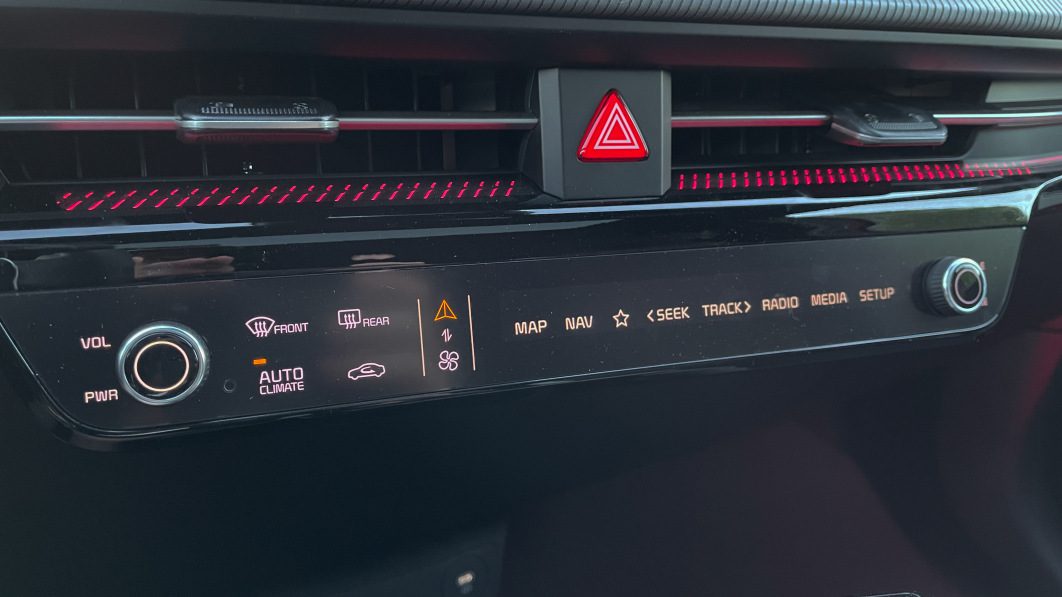
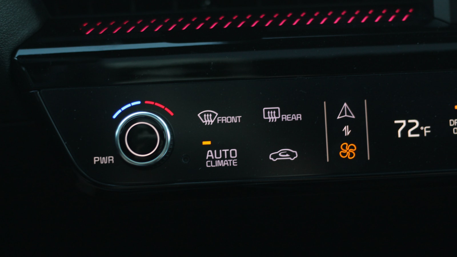
The 2022 Kia EV6’s climate and radio control panel is a weird one. It’s mostly made up of touch controls, but there are also two knobs. Countering usual logic, those two knobs don’t always control the same thing at the same time. Yeah, that’s where things get weird.
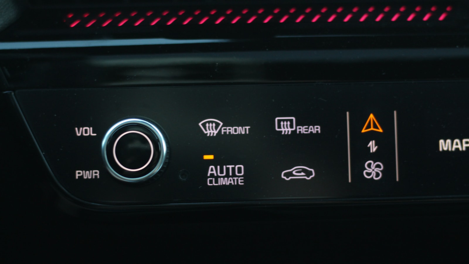
This is a situation where Kia has tried to have its cake and eat it too. Instead of having one set of controls for climate settings and another for radio/navigation, Kia decided it’s best to have a single strip of controls that you can change on the fly. A mode switcher of sorts is indicated by a blower fan and navigational arrow. Tap the touch panel here, and you’ll swap the control mode between displaying climate control settings and radio/navigation control settings. Yes, this means that the touch panel of controls is only displaying one or the other at any moment in time. It’s not only the touch panel that changes, too, but the knobs do different things based on which mode you have activated. When you’re in climate mode, twisting the knob changes the temperature setting. However, when you’re in radio/navigation mode, the driver side knob turns into a volume knob, and the passenger side knob turns into a tuning wheel.
It’s complicated to explain in words, but here’s a video to show it in action.
@autoblog 2022 Kia EV6 touch bar climate and radio controls
#carsoftiktok
#kia
#ev
#electriccar
♬ original sound – Autoblog
The idea here is fairly clear. Kia didn’t want to bury all of the vital car controls in the main touchscreen, but it also didn’t want to busy the dash with more buttons than necessary. There’s the tech aspect of it, too, in that such a control interface looks and feels futuristic compared to the company’s other center stacks.
Over the last few weeks with our new long-term tester, I’ve developed a love/irritation relationship with how these controls work in day-to-day life. On the plus side, if you’re looking for a button, it exists, and you don’t need to wade through the infotainment system to find it. You might have to tap the mode switcher to find it, but at least it’s there. I’m an especially big fan of the “Favorite” button indicated by a star that can be mapped to your desired shortcut — I set mine to go directly to Apple CarPlay/Android Auto. More and more new cars are ditching physical controls in favor of dumping everything into the main touchscreen, requiring multiple touches to find the desired effect, but not here.


On the other hand, I often forget which mode I have the touch bar set to. I’ll go to crank the volume up or down with the handy knob, but will then quickly realize I’ve just set the climate control to some scorchingly hot temperature instead of turning the volume up. This results in my needing to twist the climate control back to normal, tap the mode switcher button (which is small enough to miss with a finger tap on occasion), and then crank the volume. All of that takes some fraction of my attention away from the road. And sure, maybe it’s my fault that I didn’t remember or didn’t notice out of the corner of my eye which set of controls were being displayed. But also, maybe my passenger was the one who swapped it into climate control mode because they were cold, then never switched it back. It’s something that has come up over and over even after I’ve completely acclimated to the system.
The only accidental inputs you’ll ever make are with the knobs, too. All of the other controls are operated like a touchscreen, so you need to see and concentrate on what you’re stabbing with your finger, requiring the operator to at least glance at and read what they’re pressing.
I’m left feeling that this is both a good and bad solution at the same time. It’s better than putting every last control in the main touchscreen. But, it’s also problematic in that many owners could end up being irritated by erroneous inputs semi-frequently. My recommendation would be to try and keep it on the radio/navigation controls as much as possible. That way, when a good song comes on and your natural instinct to crank the closest knob kicks in, you’ll be doing exactly as you intended.
Related video:


